Paradoxlords Portal
Sunday, 19 June 2011
Blogger why do you hate me so?!! and Haikus
After many more attempts I havebeen able to make an upload again.
These are 3 of four Haiku tasks that i did for a college assignment for some reason the first one wont upload, im looking into it now
Monday, 31 January 2011
More pictures, enemies and alies
The First Image was a design for the grim reaper on the game over screens, but it began to progress to a more intergrated NPC character providing aid to the character should they be defeated in combat.
This Picture is a concept for a npc/ player controlled vehicle and overall assiting creature.
These final 2 Images are two forms of an enemy found in the main game, Hidden and revealed forms. In my opinion i think they still need some work because of a lack of proportion and detail.
Another batch of images
The first Image is a concept for statues found throughout the game, my initial idea for them was they would be used to obtain new weapons or upgrades, but i regressed them to scenery to allow for a more rpg-esque dynamig of looting fallen enemies.
The second image is a concept for frendly npcs located throughout the game, implimented as either companions or ai elements that aid the player without hindering them.I havent advanced on these designs as of yet.
More pictures -.-
Scenery

The First image was going to be used as a basic scenery test. It was to test indoor scenery, in my opinion the image lacks perspective and should have a higher Point of view.
The second image is an outdoor scene test, In my opinion the image worked out well but it needs more detail to the foreground image.
Concept Art 1st post
Initial Character Concepts
These images are concepts for a main character for my game design, incorperating different poses to determine which pose works best for the theme.
The Above image was intentionally going to be used in my main poster design but it was phased out due to the space required for emphasis.
The second image was also an idea for the main poster design, but was also phased out because i felt it diddn't portray the character in the way i originally intended.
Now for the uploads...
That last post took my images just fine
=D
Now comes the major image uploading =)
=D
Now comes the major image uploading =)
THe C.R.A.P principle
The C.R.A.P Priciple is made up of: Contrast,Repetition, Alignment and Proximity.
Contrast: The hompage of "http://www.thinkwithportals.com shows a good example of contrast with a dark video object against a lighter background to draw people into the video.
Repetition: The homepage for "http://www.disturbed1.com/" shows a good example of repetition by using repeated dull color schemes which draw the viewers eye around the page from lighter areas to the darker areas.
Alignment: The homepage for "http://www.deviantart.com.com/" has a good example of alignment
with the thumbnails evenly spread out to produce an eyepleasing array.
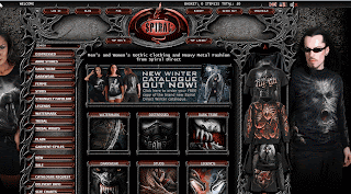
Proximity: The Hompage for "http://www.Spiraldirect.com/" Shows a good example of Proximity by grouping simmilar objects in proportion to eachother.

Subscribe to:
Comments (Atom)


